Introduction
Some people make a small confusion with histogram and barplots. So in this post we intend to provide some points about both of them.
Let’s supose that we have a sample from 200 persons, and we need to check the age distribution, so we can produce a histogram (Figure 1).
# creating data
DF = pd.DataFrame({"A" : np.random.normal(30, 0.75, 200)})
# plot
plt.figure(figsize=(8, 5))
plt.hist(DF["A"], bins = 10,
         color='steelblue',
         alpha = 0.5,
         edgecolor = 'gray' )
plt.xlabel("Age")
plt.ylabel("Count")
plt.tight_layout()
plt.show()
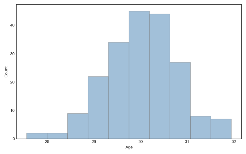
Figure 1: Histogram plot
Once we have the count, we can produce the density plot (check the
option density=True):
plt.figure(figsize=(8, 5))
plt.hist(DF["A"], bins = 10,
         color='steelblue',
         alpha = 0.5,
         edgecolor = 'gray',
         density=True)
plt.xlabel("Age")
plt.ylabel("Density")
plt.tight_layout()
plt.show()
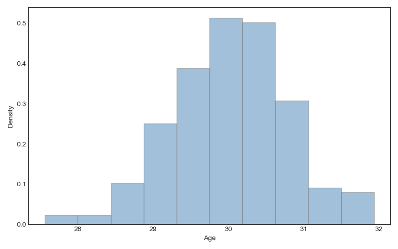
Figure 2: Histogram density plot
Notice that histogram is for counting elements in a column. It is for
distribution analysis. The barplot shows the value for a variable. If
you have a table with fuel consumption for several cars and drivers, and
you wish to show the fuel consumption for each car, or maybe, you intend
to show the fuel consumption by car and drivers, you need a bar
plot. Thus, a variable x and a variable y (maybe z variable)are
required. For instance, we can analyse the number of cars sold by month:
# data
DF1 = pd.DataFrame({"MONTH" : ['Jan', 'Fev', 'Mar'],
                    "CARSOLD" : [ 15, 10, 8]})
# plot
plt.figure(figsize=(16 / 2.54, 12.5 / 2.54))
plt.bar(DF1['MONTH'],
        DF1['CARSOLD'],
        color = 'steelblue',
        alpha = 0.5,
        edgecolor = 'gray')
plt.xlabel("Month")
plt.ylabel("Amount")
plt.tight_layout()
plt.show()
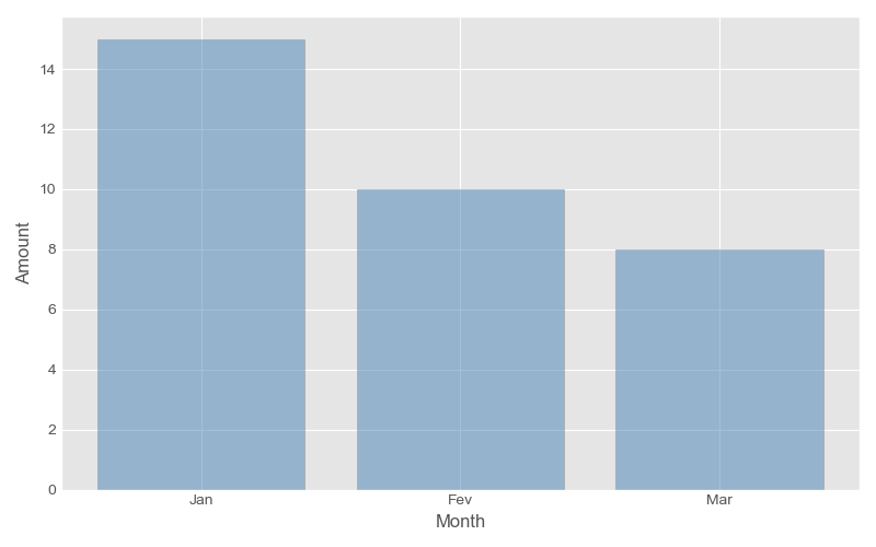
Figure 3: Bar plot, sold cars by month
It was easy. If we have as variables Month, Cars sold, and Sellers. Look the next table:
Table 1: Sold cars by month and sellers
| MONTH | SELLER | CARSOLD |
|---|---|---|
| Jan | Max | 6 |
| Jan | Ted | 4 |
| Jan | Saul | 5 |
| Fev | Max | 2 |
| Fev | Ted | 4 |
| Fev | Saul | 4 |
| Mar | Max | 2 |
| Mar | Ted | 3 |
| Mar | Saul | 3 |
First of all, we create a DataFrame for our data.
DF2 = pd.DataFrame({"MONTH" : np.repeat(['Jan', 'Fev', 'Mar'],3),
                    "SELLER": np.tile(['Max', 'Ted', 'Saul'],3),
                    "CARSOLD" : [6,4,5,2,4,4,2,3,3]})
The problem is that Matplotlib does not understand the “Seller” as
category, so it will not work:
plt.bar(DF2['MONTH'],
        DF2['CARSOLD'],
        color = DF2['SELLER'], alpha = 0.5)
We need a little trick, We can use conditional, for, and 3 list
with some colors:
# lists
COLORS = ['blue', 'steelblue', 'lightgreen']
SEL = DF2['SELLER'].unique()
ind = np.arange(len(COLORS))
# plot
w = 0
plt.figure(figsize=(8, 5))
for i in range(len(SEL)):
    DD = DF2[DF2['SELLER'] == SEL[i]]
    plt.bar(ind + w,
            DD['CARSOLD'],
            color = COLORS[i],
            label = SEL[i],
            width=0.2, align="center")
    w = w + 0.2
plt.xticks(ind + w / 2, ('Jan', 'Fev', 'Mar'))
plt.tight_layout()
plt.legend()
plt.show()
and … yeaahhh!!!

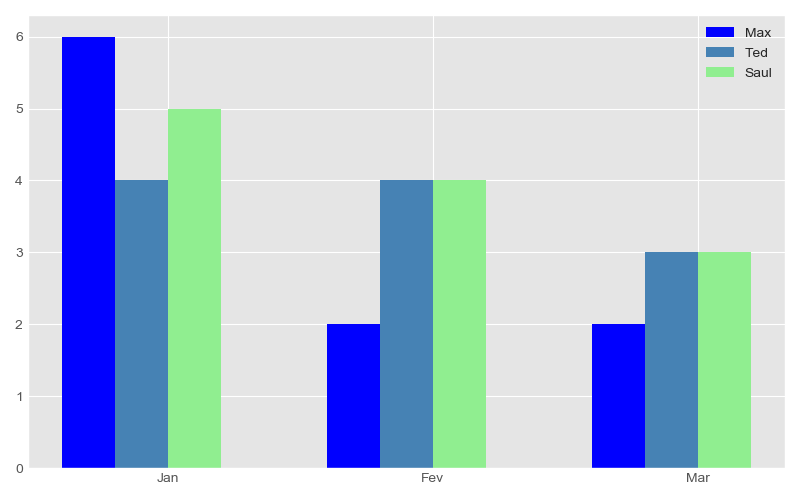
Figure 4: Bar plot, sold cars by month and sellers
If you have no time to handle with for and create list (it could be
boring), you have an alterative. For our hapiness we have seaborn.
plt.figure(figsize=(8, 5))
sns.barplot(x='MONTH',
            y = 'CARSOLD',
            hue = 'SELLER',
            data = DF2,
            palette = 'Set2')
plt.tight_layout()
plt.show()
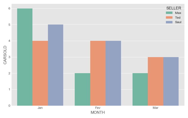
Figure 5: Seaborn Bar plot, sold cars by month and sellers
Conclusion
Matplotlib is very powerful, but some times it is
inconvenient. Specially for plot with categorical variables. Thus, if
usually you do not have a lot of time, I recommend seaborn. However,
for complex plots, matplotlib can save you.
Let me know you have some question.