Nota
Este post tem como finalidade APENAS o estudo de análises de variação de preços para fins didáticos. Não trata-se de recomendação ou indicação de investimento. Salienta-se que o código não foi revisado e há possibilidade de haver erros.
Motivação
Em ciências de dados obter e analisar dados é rotina de trabalho. Com finalidade de fixar conteúdo e praticas uma análise simples, este estudo teve como objetivo calcular a diferença entre variação de preço médio mensal e a anual de um ativo.
Os resultado obtidos foram plotados no padrão de Heat map (mapa de
calor), utilizado dois pacotes gráficos, Seaborn (Figura 1) e
Matplotlib (Figura 2).
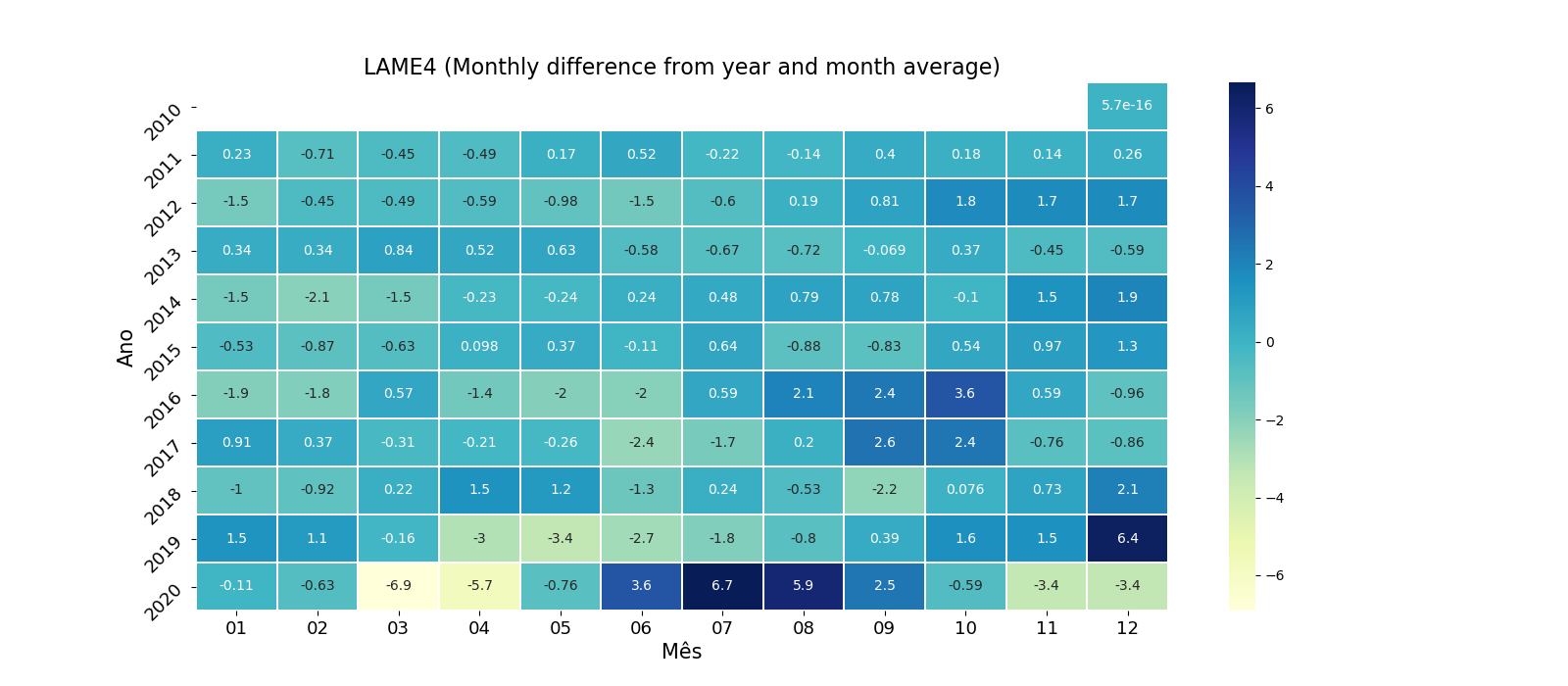
Figura 1: Heat map usando Matplotlib
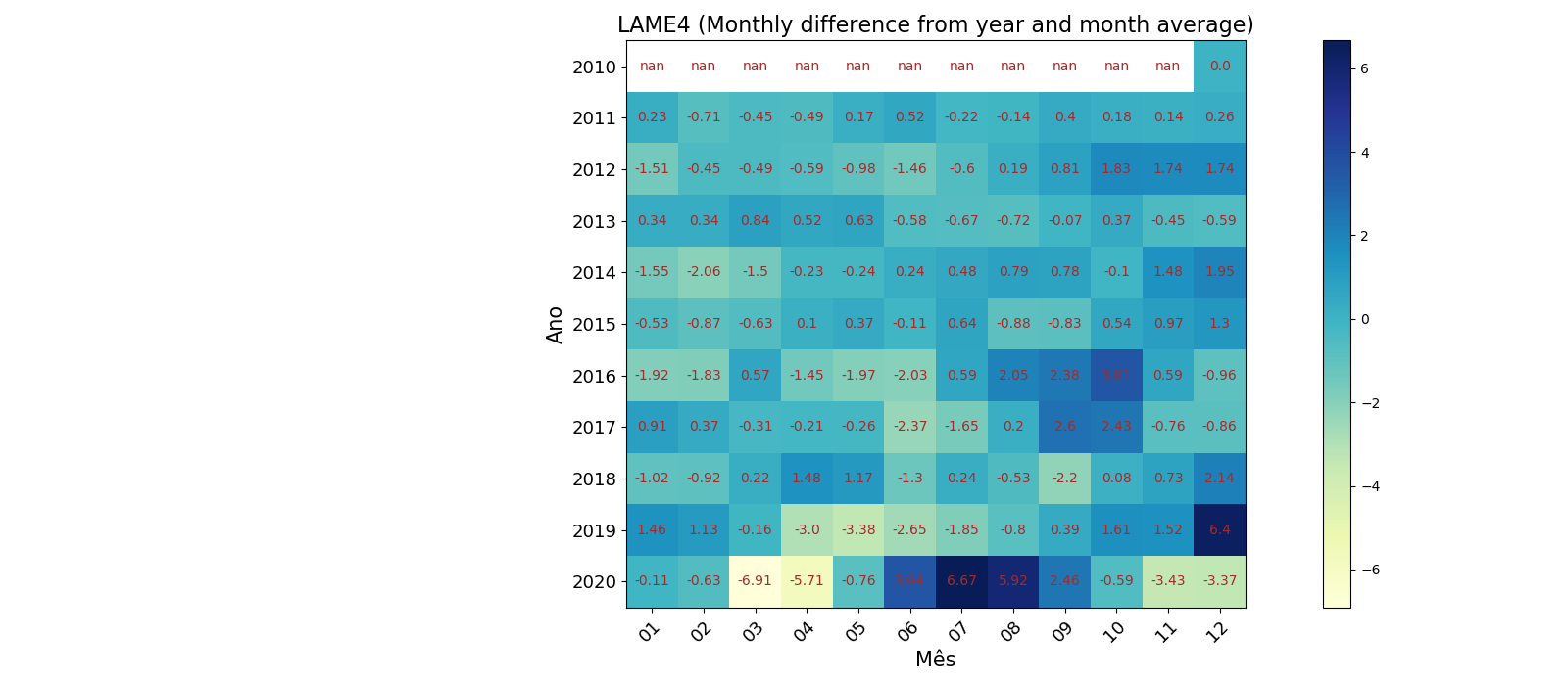
Figura 2: Heat map usando Matplotlib
O código para obtenção dos dados, processamento e geração dos gráficos está descrito a seguir:
import requests
import pandas as pd
import datetime as dt
import numpy as np
import matplotlib.pyplot as plt
import seaborn as sns

# ------------------------------------------------------------
# Note: You must create a subfolder called <csv_files>
# ------------------------------------------------------------

# ------------------------------------------------------------
# Some functions


def fun_datastamp(x): return dt.datetime.strptime(x, dtfmt)


def fun_monthnumber(x): return dt.datetime.strftime(x, '%m')


def fun_year(x): return dt.datetime.strftime(x, '%Y')


def fun_int(x): return int(x)


dtfmt = '%Y-%m-%d'

# ------------------------------------------------------------
# get data from yahoo finance

csv_url = 'https://query1.finance.yahoo.com/v7/finance/download/LAME4.SA?period1=1292371200&period2=1607990400&interval=1d&events=history&includeAdjustedClose=true'
req = requests.get(csv_url)
url_content = req.content
csv_file = open('./csv_files/lame4.csv', 'wb')
csv_file.write(url_content)
csv_file.close()

# ------------------------------------------------------------
# reading csv_file ()

df_stock = pd.read_csv('./csv_files/lame4.csv', header=0, sep=',')
df_stock = df_stock.dropna().reset_index(drop=True)

# ------------------------------------------------------------
# Working with Dates and Differences

df_stock['Avr'] = (df_stock.iloc[:, 3] + df_stock.iloc[:, 2]) / 2
df_stock['Timestamp'] = df_stock['Date'].apply(fun_datastamp)
df_stock['Year'] = df_stock['Timestamp'].apply(fun_year)
df_stock['Year'] = df_stock['Year'].apply(fun_int)
df_stock['Month'] = df_stock['Timestamp'].apply(fun_monthnumber)

avr_price_year = df_stock.groupby('Year')['Avr'].mean().reset_index()
avr_price_year = avr_price_year.to_numpy()

ls_diffmonyear = []
for i in range(len(df_stock)):
    yy = df_stock.iloc[i, 9]
    yy_avr = avr_price_year[avr_price_year[:, 0] == yy][0][1]
    mon_diff = df_stock.iloc[i, 7] - yy_avr
    ls_diffmonyear.append(mon_diff)
df_stock['Diff_monyear'] = ls_diffmonyear

df_stock_group = df_stock.groupby(['Year', 'Month'])[
    'Diff_monyear'].mean().reset_index()
df_stock_piv = df_stock_group.pivot('Year', 'Month', 'Diff_monyear')

# ------------------------------------------------------------
# Plotting with Seaborn

plt.figure(figsize=(16, 7))
sns.heatmap(df_stock_piv, annot=True, linewidths=.5, cmap="YlGnBu")
plt.xlabel('Mês', fontsize=15)
plt.ylabel('Ano', fontsize=15)
plt.xticks(fontsize=13)
plt.yticks(rotation=45, fontsize=13)
plt.title("LAME4 (Monthly difference from year and month average)", fontsize=16)
# plt.savefig('./pics/lame4_diif_monyearavr_sns.png')
plt.show()

# ------------------------------------------------------------
# Plotting with matplotlib

xxticks = list(df_stock_piv.columns)
yyticks = list(df_stock_piv.index)
vvalues = df_stock_piv.values

fig, ax = plt.subplots(figsize=(16, 7))
im = ax.imshow(vvalues, cmap="YlGnBu")
plt.colorbar(im)
# We want to show all ticks...
ax.set_xticks(np.arange(len(xxticks)))
ax.set_yticks(np.arange(len(yyticks)))
ax.set_xticklabels(xxticks, fontsize=13)
ax.set_yticklabels(yyticks, fontsize=13)
plt.setp(ax.get_xticklabels(), rotation=45, ha="right",
         rotation_mode="anchor")
plt.xlabel('Mês', fontsize=15)
plt.ylabel('Ano', fontsize=15)
ax.set_title(
    "LAME4 (Monthly difference from year and month average)", fontsize=16)
# Loop over data dimensions and create text annotations.
for i in range(len(yyticks)):
    for j in range(len(xxticks)):
        text = ax.text(j, i, round(vvalues[i, j], 2),
                       ha="center", va="center", color="brown")
fig.tight_layout()
# plt.savefig('./pics/lame4_diif_monyearavr.png')
plt.show()