Introduction
PCA (principal components analysis) is multivariate statistical method that concerned with examination of several variables simultaneously. The idea is provide a dimensionality reduction of data sets, finding the most representative variables to explain some phenomenon. Thus the PCA analyses inter-relation among variables and explains them by its inherent dimensions (components). If there is NO correlation among the variables, PCA analysis will not be useful.
This post is divided in two section. One of them is about tidy data and the another one is about PCA.
Tidy data
We will use sklearn library in Python to solve the PCA. This library
demands a data set with a specific format:
| SAMPLE | X1 | X2 | X3 | X4 | X5 |
|---|---|---|---|---|---|
| 0 | 156 | 245 | 31.6 | 18.5 | 20.5 |
| 1 | 154 | 240 | 30.4 | 17.9 | 19.6 |
| 2 | 153 | 240 | 31 | 18.4 | 20.6 |
| 3 | 153 | 236 | 30.9 | 17.7 | 20.2 |
| 4 | 155 | 243 | 31.5 | 18.6 | 20.3 |
For some reason you loaded your data and get something like that:
import numpy as np
import pandas as pd

df = pd.read_csv('birds.csv', sep=',', header=0)
df.head(8)
| VAR | Y |
|---|---|
| X1 | 156 |
| X2 | 245 |
| X3 | 31.6 |
| X4 | 18.5 |
| X5 | 20.5 |
| X1 | 154 |
| X2 | 240 |
| X3 | 30.4 |
An alternative to tidy data to use pivot method. Check the code and
comments as follows:
# create a ID column to identify the measures `X1 X2 X3 X4 X5`
df['ID'] = np.tile([1, 2, 3, 4, 5], 49)
# create a column to identify the samples
ls_sample = []
for i in range(49):
    a = np.repeat(i, 5)
    ls_sample.append(a)
df['SAMPLE'] = np.concatenate(ls_sample)
# apply pivot (it is the oposite of `melt` method)
df_pca = df.pivot_table(index="SAMPLE",
                        columns='ID')['Y'].reset_index()
We got:
>>> df_pca.head(8)
ID  SAMPLE      1      2     3     4     5
0        0  156.0  245.0  31.6  18.5  20.5
1        1  154.0  240.0  30.4  17.9  19.6
2        2  153.0  240.0  31.0  18.4  20.6
3        3  153.0  236.0  30.9  17.7  20.2
4        4  155.0  243.0  31.5  18.6  20.3
5        5  163.0  247.0  32.0  19.0  20.9
6        6  157.0  238.0  30.9  18.4  20.2
7        7  155.0  239.0  32.8  18.6  21.2
Notice that we got 7 columns. The ID columns is Index, another
columns are columns:
>>> df_pca.columns
Index(['SAMPLE', 1, 2, 3, 4, 5], dtype='object', name='ID')
For a better data understanding We may rename the columns name:
# change columns name
df_pca.columns = ['SAMPLE', 'X1', 'X2', 'X3', 'X4', 'X5']
>>> df_pca.head(8)
   SAMPLE     X1     X2    X3    X4    X5
0       0  156.0  245.0  31.6  18.5  20.5
1       1  154.0  240.0  30.4  17.9  19.6
2       2  153.0  240.0  31.0  18.4  20.6
3       3  153.0  236.0  30.9  17.7  20.2
4       4  155.0  243.0  31.5  18.6  20.3
5       5  163.0  247.0  32.0  19.0  20.9
6       6  157.0  238.0  30.9  18.4  20.2
7       7  155.0  239.0  32.8  18.6  21.2
Once we tided the data set it is time to run PCA.
PCA
Keep in mind that I will not show mathematics equations or solve all PCA with my own
code. To make it simple we will use sklearn library.
ATTENTION!!! We will use another one data set to run PCA.
You can download the data set here. More details about you can find here.
We will need load:
from sklearn.decomposition import PCA
from sklearn.preprocessing import StandardScaler
import matplotlib.pyplot as plt
import seaborn as sns
df_data = pd.read_csv('pardal.txt', header=0, sep='\t')
df_data.shape
>>> df_data.head(5)
   survive  length  alar  weight   lbh   lhum   lfem  ltibio  wskull  lkeel
0        1     154    41     4.5  31.0  0.687  0.668   1.000   0.587  0.830
1        0     165    40     6.5  31.0  0.738  0.704   1.095   0.606  0.847
2        0     160    45     6.1  30.0  0.736  0.709   1.109   0.611  0.840
3        1     160    50     6.9  30.8  0.736  0.709   1.180   0.600  0.841
4        1     155    43     6.9  30.6  0.733  0.704   1.151   0.600  0.846
So, we have 10 columns and 56 rows. Now it is necessary split the data
set in features and target. Features are all measured data, and
target is about the survive condition. Each study can have different
targets like machines, locals, etc. For this case we will use x
for features and y for target. Let’s create a list to represent
features:
features = ['length', 'alar', 'weight', 'lbh', 'lhum',
            'lfem', 'ltibio', 'wskull', 'lkeel']

# Separating out the features
x = df_data.loc[:, features].values

# Separating out the target
y = list(df_data['survive'])
Once We assigned the variables, we can start. Let’s the game begin!

First of all, We can check the correlation among variables:
plt.figure(figsize(9, 9))cmap = 'viridis_r', annot = True)
sns.heatmap(df_pca.data[:, features].corr(),
            cmap = 'viridis_r', annot = True)
plt.tight_layout()
plt.show()
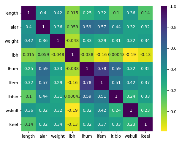
Figure 1: Correlations
Notice if there are considerable correlation among variables. In this case We have, thus Go Ahead!
PCA is effected by scale so We need to scale the features before applying PCA. StandardScaler is an option to standardize the dataset’s features into unit scale (mean = 0 and variance = 1).
sc = StandardScaler()  # Normaliza os dados z = (x - media)/sd
x = sc.fit_transform(x)
Now we run PCA for all possible dimensions, I mean “PC1”, “PC2”, …,
pca=PCA()
principalComponents=pca.fit_transform(x)
Verifying how much explanation for each principal component, or in other words, variance caused by each of the principal components.
evry = pca.explained_variance_ratio_
evrx = np.arange(1, len(evry)+1)
plt.figure(figsize=(9, 5))
plt.bar(x=evrx, height=evry)
plt.xlabel('PCA')
plt.ylabel('Variance')
plt.tight_layout()
plt.show()

Figure 2: Variance caused by each of the principal components
Notice We have reached 3 components which cumulative variance is around
0.65 of the variation in the data set. At begin We have 9 variables and
reduced it to 3. Now We can compute the correlation between each sample
and PC1, PC2, PC3, … PCn, if you use R it is easy, just
pca$scores. In Python we run pca.fit_transform(x).
ls_pcs = []
for i in range(len(features)):
    tt = 'PC' + str(i+1)
    ls_pcs.append(tt)
df_pcSamples = pd.DataFrame(principalComponents,
                            columns=ls_pcs)
df_pcSamples['SAMPLE'] = y

plt.figure(figsize=(9, 7))
sns.heatmap(pd.concat([df_data.iloc[:, 1:],
                       df_pcSamples.iloc[:, 0:2]],
                      axis=1).corr(),
            cmap='viridis_r', annot=True)
plt.tight_layout()
plt.show()
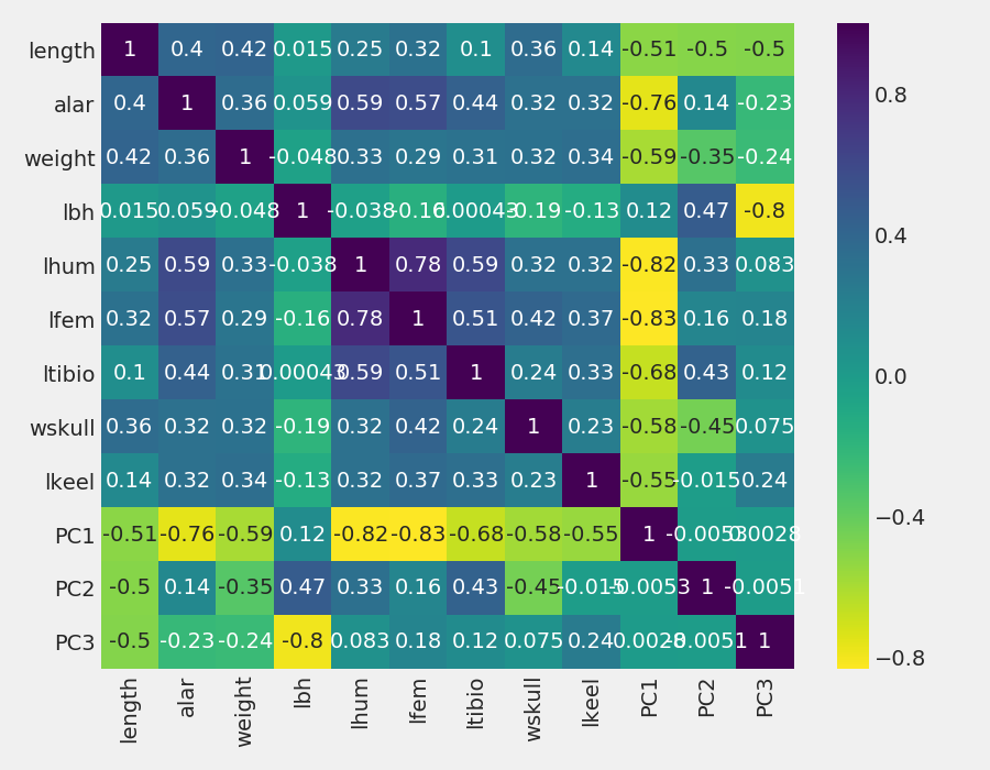
Figure 3: “Scores” of each individual object (birds) computed as linear combinations of the original variables
Notice that PC1 is negatively correlated with the most, Therefore when PC1 increases, features values decrease. The opposite occurs for PCA2 and PC3, where there is a mix of positive and negative correlations. An observation is about the correlations among PCs, all of them are 0. It is because principal components are not correlated.
A nice visualization to observe the features behaivor for each PC is the biplot. NOTE: I would like to appreciate Makis for share this explanation and share the code to a better understanding how to do this visualization.
df_pcFeatures = pd.DataFrame()
df_pcFeatures['FEATURES'] = features
df_pcFeatures['PC1'] = list(pca.components_[0])
df_pcFeatures['PC2'] = list(pca.components_[1])
df_pcFeatures

scalex = 1.0/(df_pcSamples['PC1'].max() - df_pcSamples['PC1'].min())
scaley = 1.0/(df_pcSamples['PC2'].max() - df_pcSamples['PC2'].min())

plt.figure(figsize=(10, 7))
for i in range(len(df_pcFeatures)):
    plt.annotate(df_pcFeatures.iloc[i, 0],
                 (df_pcFeatures.iloc[i, 1]*1.12,
                  df_pcFeatures.iloc[i, 2]*1.12), size=13)

for i in range(len(df_pcFeatures)):
    plt.arrow(0, 0,  df_pcFeatures.iloc[i, 1],
              df_pcFeatures.iloc[i, 2],
              width=0.003,
              head_width=0.02)

sns.scatterplot(x=df_pcSamples['PC1']*scalex,
                y=df_pcSamples['PC2']*scaley,
                hue='SAMPLE', data=df_pcSamples,
                s=43, palette='seismic_r')

plt.axvline(0, color='gray', linestyle='dashed', linewidth=1)
plt.axhline(0, color='gray', linestyle='dashed', linewidth=1)
plt.title('Biplot for  2 main components')
plt.xlabel('PCA1 = ' + str(ratio_pca1) + '%')
plt.ylabel('PCA2 = ' + str(ratio_pca2) + '%')
plt.xticks(np.arange(-1, 1.1, 0.2))
plt.yticks(np.arange(-0.6, 0.7, 0.2))
plt.tight_layout()
plt.savefig(
    '/home/rafatieppo/Dropbox/profissional/site_my/content/post/pics/20200321_biplot.png')
plt.show()
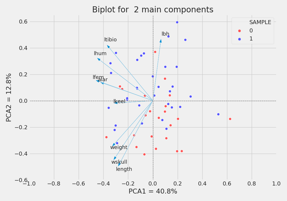
Figure 4: Biplot for two main components. (0 no survive, 1 survive)
As we observed in correlations plot, the features weight, wskull and length are negative correlated with PC1 and PC2, and lbh is positive correlated with PC1 and PC2. Besides, It is possible to note more survivals (blue) in the top half of the plot than towards the bottom. Maybe its is an effect of morphology on survival. Thus PC2 is kind off “splitting” the samples (survival and not survivel), and the features, wskull, length,ltibio and lbh has more participation in PC2 than all other features (check correlations). It means that we may reduced the numbers of features from 9 to 4 to further studies and try understand what is happening. Just like a guess, MAYBE survivor tends to be lighter and shorter.
Best regards
References
MANLY, B. F. J.Métodos Estatísticos Multivariados: uma introdução. 3rd. ed.
https://operdata.com.br/blog/analise-de-componentes-principais/
https://richardlent.github.io/post/multivariate-analysis-with-r/
https://www.fieldmuseum.org/blog/hermon-bumpus-and-house-sparrows